Arielle Mohr's Website

  • About
  • Resume

Oracle Internship

by

At Oracle, I worked for the Construction and Engineering Global Business Unit as a UX Design Intern for over a year. I worked primarily with Oracle’s Primavera construction software, including their best-selling product, P6 software, used by Oracle clients such as NASA, IKEA, Tesla and Walt Disney.

As a UX Design Intern, I led usability testing for software including P6, Textura and Prime Projects. I also redesigned Primavera Analytics, the data management software for all of Oracle’s construction software products. My responsibilities also included icon design for these software products.

Click the links below to find out more about specific projects I worked on while at Oracle:

Usability Testing — I was made head of usability testing for our unit at Oracle. The Usability Testing page describes my responsibilities in that position.

Primavera Analytics — I redesigned this data management software. The Primavera Analytics page describes my responsibilities during this project.

Mobile App Promotion Page — I designed the Apple App Store icons for each of of our mobile applications. Check out the Mobile App Promotion page to see samples of my work and learn about my work in this area.

Icon Design — I was responsible for designing and researching icons for our unit’s products. Check out the Icon Design page to see samples of my work.

Filed Under: App Design, Icon Design, Software Design, Usability Testing, Website Design

Coalescence Interactive Exhibit

by

To fulfill Drexel’s undergraduate degree requirements, I worked with eight other students on a senior year capstone project in which we created an interactive pop-up exhibit, housed in the University’s Pearlstein Gallery. Our exhibit, named Coalescence, highlighted the work of two Philadelphia minority creators, Ange Branca and Lendeh Sherman. Ange Branca owns an award-winning Malaysian restaurant called Sate Kampar in Philadelphia. Lendeh Sherman is fine arts artist creating art using many different mediums from textiles to light painting. Coalescence took visitors through experimental technology and experiences, showcasing the lives and artistry of the featured creators.

With 4 different interactions using web technologies (NFC chips, iPad web applications, Leap Motion, and a 60 inch multi-touch screen) and a user-centered design process we created an engaging experience for visitors to immerse themselves in the artists’ creations and their cultures.

Process

Building apps and websites is part of the curriculum of the Digital Media department, but our team wanted to create something that used those skills in a completely new environment. So we decided to create an interactive exhibit with a positive and informative message.

We wanted to cover an impactful topic, so we decided to focus on immigration in Philadelphia as a whole. We then realized that instead of just using numbers and charts to illustrate immigration, we could tell the stories of immigrants and the inspiring gifts that they bring to our community, using digital media. We were then introduced, through another professor, to our two creators, Ange and Lendeh, who shared their inspiring stories with us.

After meeting with these artists we started working on the different interactions we wanted to use to showcase their work and engage our visitors. We settled on four different interactive technologies to show each of the artists’ creations. Once these were decided upon, we researched the technologies, exhibit designs, and the artists’ backgrounds and cultures.

Research

Exhibit Design Research

Since we had never built an exhibit before, we needed to research exhibit design and get advice from people in the industry. We met with Night Kitchen Interactive, a Philadelphia company that specializes in exhibit design, and told them about our ideas. They helped us refine our interactions and taught us different techniques they use when building exhibits.

Personas

After meeting with Night Kitchen, we conducted user research and defined the types of visitors who may want to visit our exhibit. We wanted our interactions to be intuitive to any type of user who may visit and we realized that we would be getting a wide range of different visitors.

These are personas of potential visitors to the exhibit:

User Journeys

We also developed user journeys, which were especially crucial for this project. These helped us define the types of paths a visitor may take when entering the exhibit, and the kinds of emotions they may feel interacting with each section. This information helped us to evaluate the types of messages Coalescence may be sending to our visitors.

Design

Style Guides

After learning about our artists’ backgrounds we defined a color palette that represented colors from both of their cultures. This style guide was set early on to make sure that all of our designs felt unified and representative of the artists.

Wireframing

This is a wireframe of the physical loom structure displayed in the exhibit. We created wireframes for all four of our interactions to layout the experiences. Here is an example of our interactive loom wireframe.

Mockups & Prototypes

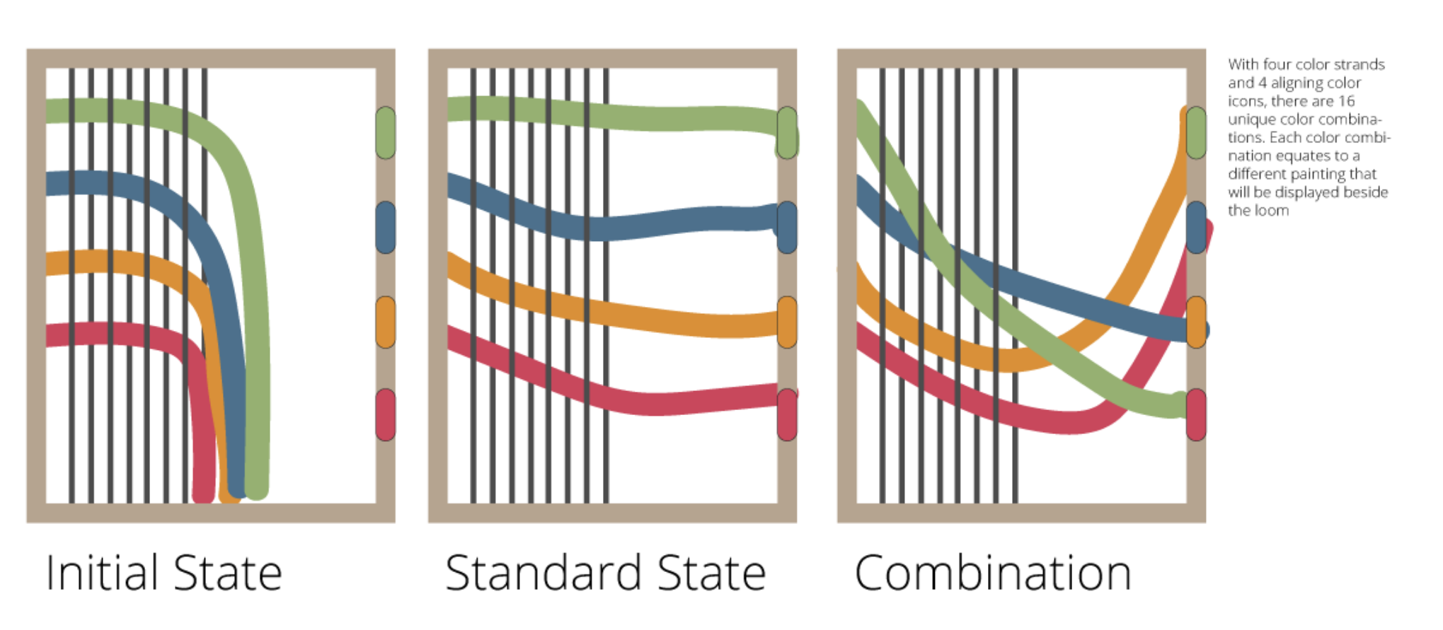
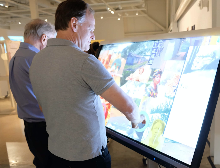
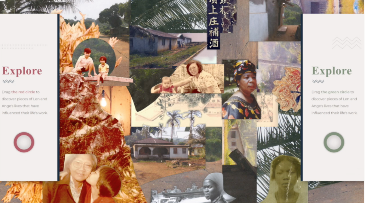
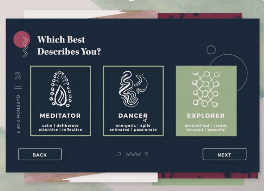
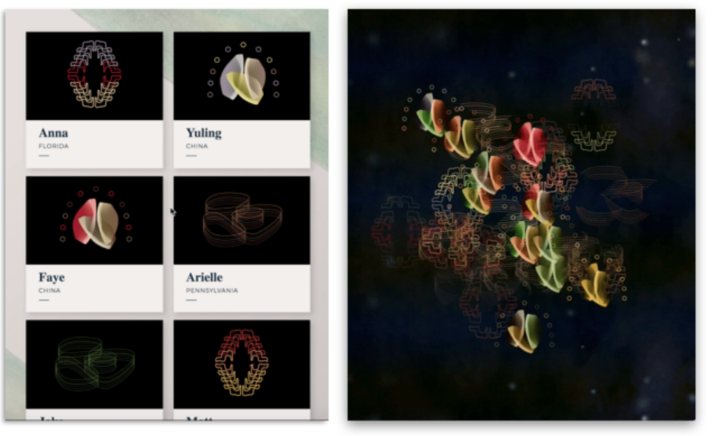
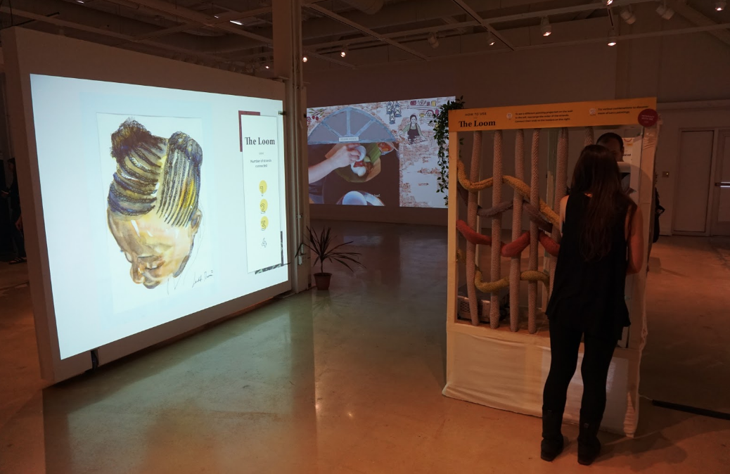
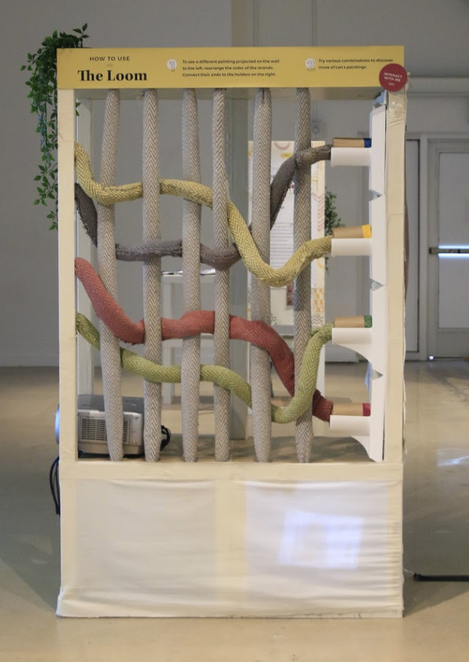
Because we could not use the actual exhibit space for testing, we had to create prototypes to represent these interactions and to use for early user feedback. Here is one of our first mid-fidelity designs of our gallery interaction.

Test

Over the course of nine months, we conducted over 100 usability tests on all of our exhibit interactions, which we believe is what made our designs so user-centric. Here are some photos from these tests. Along with these tests we wrote analyses after each session which helped us evaluate any must fix items.

Build

Our final results required a lot of building, including a 6-foot tall loom and structures built using IKEA tables. We made sure to assemble all the pieces of art in a user-friendly way that allowed users to view the materials closely and even touch some of the pieces.

Results

Here are the final interactions in the exhibit being used on the day of the show!

The gallery showed visitors the backgrounds of Ange and Len by using a multi-touch screen. Two visitors simultaneously dragged over each photo of theirs to learn more about their history.

The digital mural used gesture-control technology by Leap Motion, which allowed users to select food carts by waving their hand over the different carts representing different traditional Malaysian dishes/drinks, such as Nasi Lemak, Sate, and Kopi. Once the food cart was selected, visitors watched videos of these dishes being made.

The energy table allowed users to leave their own personal mark on the exhibit. Visitors were asked a few questions about themselves such as what spices they enjoy, which allowed them to create a personalized energy form. The energy form was then added to the collective projected energy wall symbolizing that when we all come together we can create something beautiful.

The Loom used NFC technology, which are chips that were placed inside each strand and detect when a connection is made. The loom was built for users to participate in the textile creation process while exploring Len’s paintings. By connecting the four physical strands to NFC readers, visitors would see one of 24 paintings created by Len.

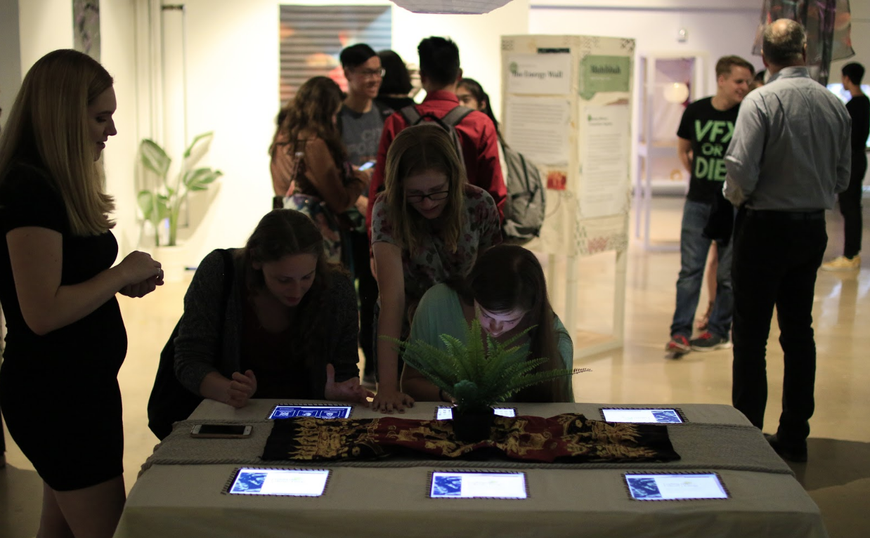
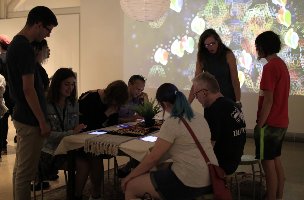
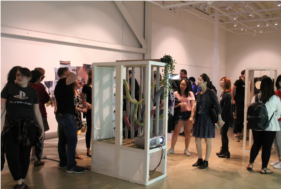
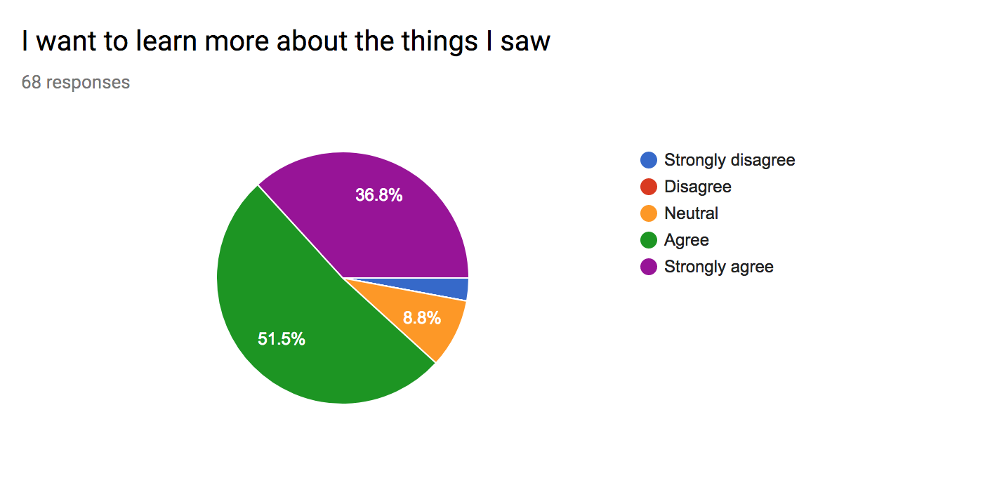
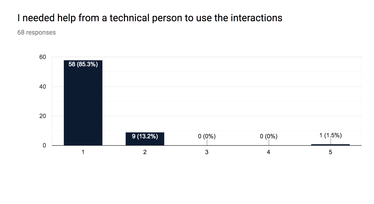
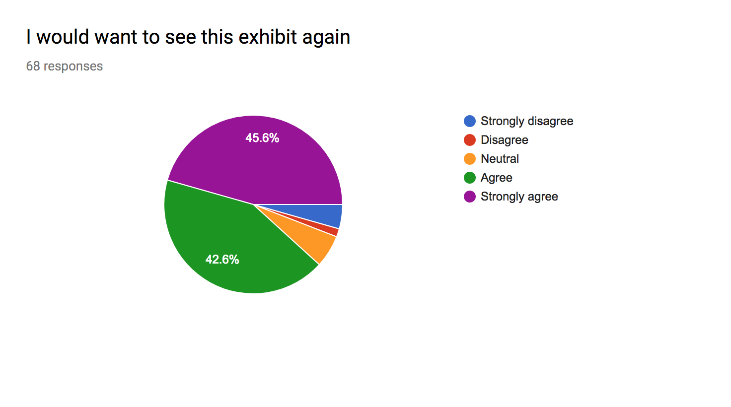
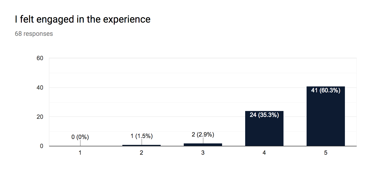
Overall, Coalescence was a huge success as we had over 200 visitors come to see our show during the two hours it was open.

We set up a survey table at the exit where visitors could share their final thoughts on the exhibit. We asked visitors to rate how easy the interactions and exhibit were to navigate. The survey results showed that most users found the exhibit easy to navigate and the interactions intuitive to use. Many visitors said that they would like to return to our exhibit in the future.

Here are survey results used for an evaluation of the success of our exhibit.

Here are some other user reactions

“I also really appreciate how much every aspect of the exhibit, down to the backdrop of the descriptions and the plants on the wall, was stylized and designed. This exhibit was unlike anything I’ve experienced before, and I hope to be able to see it again somewhere.”

“It’s incredibly well executed and unified. The amount of thought put into this shows. It beautifully tells the stories of the women this exhibit centered on.

“Fun, well integrated design and technology, thought provoking while simple enough to engage”

Reflection

This was the most rewarding, but also most challenging project of my college career. Figuring out how to design intuitively for a physical exhibit space while not being able to test in the actual space was quite challenging. I learned so much about exhibit design from this project and being able to apply my UX knowledge in new ways taught me so much more about the variability of UX design. Here are three things I learned from this experience:

  1. Testing the physical space and setup of an exhibit is just as important as testing the digital pieces.
  2. Getting user feedback early on, even on just ideas, helps greatly. You don’t want to start building something only to realize it falls flat.
  3. Always ask your visitors the message they took away at the end of the exhibit. Different positive reactions are good but you also don’t want information to be misinterpreted.

I’m so happy and proud that Coalescence was such a success and I would love to be a part of a project like this again in the future.

Filed Under: App Design, Exhibit Design, Usability Testing

Schmear It Mobile App

by

For a class project at Drexel University, our team was tasked with creating a mobile ordering app for Schmear It, a local food truck that sells bagels in Philadelphia. Designing this app was a class project, not intended to be actually used by Schmear It.

After brainstorming and researching potential users, we realized that a social rewards system was much more suitable than a mobile ordering system. Our decision was made because bagels are made fresh and quickly, and Schmear It already had a punch-card rewards system in place.

The Schmear It app we created allows users to keep track of their orders, save their favorite bagels, earn digital rewards and discover new combinations of ingredients based on other customers ratings. Click on the image below to see the live prototype in action!

Click me!

Process

As a UX researcher for this team, I started off by conducting thorough research on Schmear It’s brand, customers and values. Here are the steps I took in helping to create this app.

Research

User Interviews

By conducting user interviews we were able to find out how users use mobile ordering services and what they would like to see from a mobile ordering app

Fly on the wall (Ethnographic Study)

Fly on the wall testing showed us the type of customers who ordered from this truck. By standing by the truck and observing user behavior we were able to note many important points about user interactions with the truck ,which helped us make important design decisions. Schmear It had many frequent customers, which we deduced from the interactions they had with the staff. The staff asked many of the customers questions about their personal lives, indicating they had built a friendly relationship with them.

From this exercise we determined who their target users were and how many of them were extremely loyal to Schmear It. Additionally, we were able to observe the ordering process and the short amount of time that it took for customers to receive their custom made bagels. On average the wait time was around one minute, which indicated to us that mobile ordering may not be beneficial. Additionally, an app risked the possibility of removing customers’ interaction with the friendly staff.

Personas

From the fly on the wall activity, we were able to create different personas based on the types of customers we observed at the truck. Our potential users included college students, professors and local workers, such as construction workers. The most common users were college students since this truck parks on college campuses. This meant that our target users were likely familiar with smart phones and rewards apps, so there would be value in creating a digital rewards system.

Reward Systems App Benchmarking

Once we determined we were creating a digital rewards system app, we did benchmarking on successful rewards systems, such as Starbucks. One of our favorite things about the Starbucks app was the visual of a cup filling up as you earned rewards. We decided to incorporate a similar idea with an image of a bagel filling up as you earned rewards.

Design

Sketches

Our team participated in a ten-minute sketch session where we were each given print outs of empty phone screens and had to sketch any ideas of pages we had for our app. This led to some of the very first ideas behind our functionality

2wbdv220-userresearchfindings-anm67-copy

Wireframes

After creating final sketches of the pages we needed to include, we created wireframes of the pages.

Low Fidelity Prototype

As a team, we designed many iterations of our prototype. We did usability testing early in the project to ensure our design was fluid and adaptive to our users’ needs as we gained more feedback.

High Fidelity Prototype

Here is the live prototype we created: High Fidelity Prototype. The front page was fully designed by me with the idea of incorporating Schmear It’s logo banners as buttons to stay consistent with their branding.

Another important piece of the app is the charity page. Schmear It values charity work and each week chooses a different charity to which to donate. To encourage donations and keep users informed about their service, we added a charity page that informs users of the charity for that week and how they can learn more about that charity.

Test

Usability Testing

We started this process with paper prototype usability testing as seen above. Users would tap the pieces of paper after given their tasks and the next page would be presented to them. Once a fully functional prototype was created, we continued to usability test using that instead.

Schmear It is known for their many choices of toppings. After talking to our users we realized that one common concern they had was being able to try new toppings. We created a ranking system in the app that lets users rate bagels they have tried and go to the Past Bagels page to see their order history and how they rated each bagel.

Users can also check out the Popular Bagels page which shows other users’ rankings and which bagel combinations they recommend. The app has categories such as Sweet and Savory, so users can refine their searches.

Results

This app went through many iterations but in the end we thought the final design was the most true to Schmear It’s brand. By sticking to their colors, imagery and encouraging users to try new bagels, the app helps reinforce Schmear It’s branding. Also, a ranking and rewards system can help Schmear It’s loyal users feel more connected to a food truck they already love.

Reflection

This project showed us the importance of branding and user needs. By creating a rewards system instead of a mobile ordering app, we met our user’s needs in the best way possible by not just making an obvious app for a food service, but instead evaluating what would be most beneficial to their users specifically and staying true to the brand’s freshness and in-person interactions.

Filed Under: App Design, Usability Testing