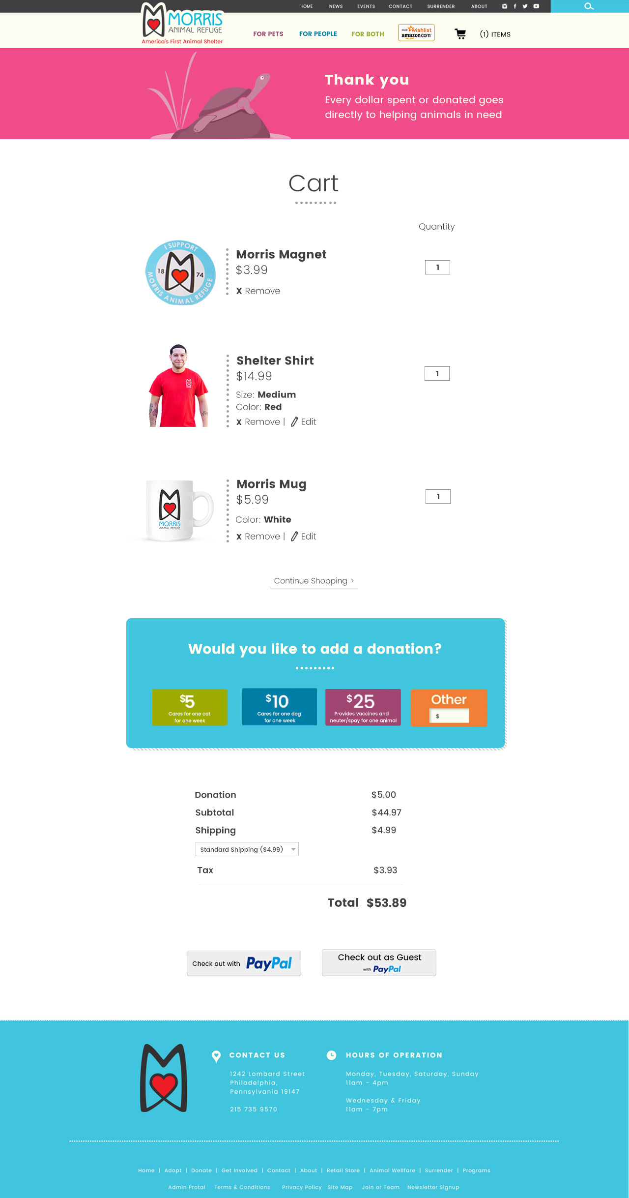
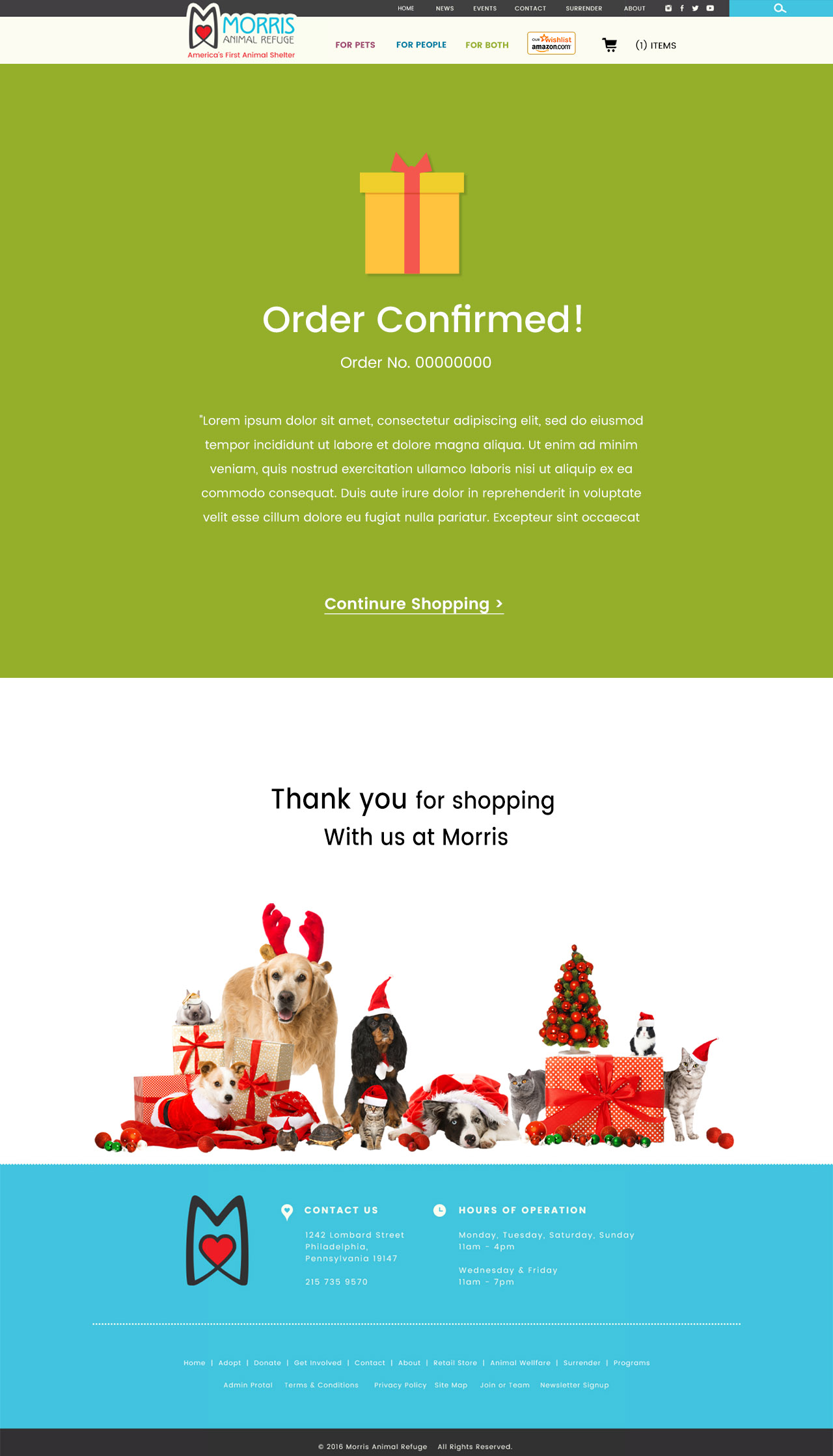
For the Morris project our team of six was tasked with redesigning the e-commerce store for a local animal shelter, Morris Animal Refuge, by incorporating the design of their main site. We worked collectively with AYC Media, the designer of our main site, to ensure our designs matched the existing site. As head UX researcher, I focused heavily on ensuring our designs were as user-friendly as possible because a non-intuitive design could be the reason a user strays from making a donation, adopting an animal in need or purchasing merchandise.
Project Goals
- Create an e-commerce shop that’s user-friendly and represents the Morris brand
- Encourage users to donate, adopt and shop to help increase shelter funds
- Create a seamless, cohesive experience with AYC’s existing website design
Process
We followed an agile process in which our designs were heavily researched, tested and reiterated based on feedback from the client, users and further research.
Research
Personas
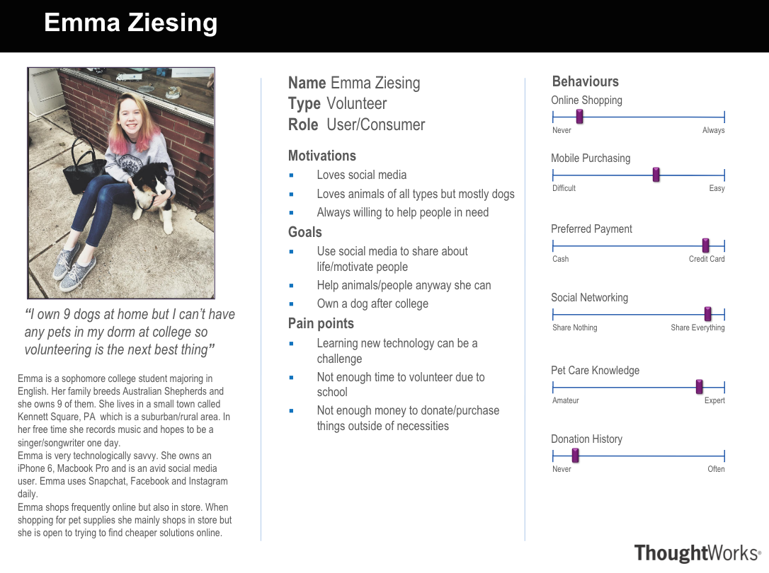
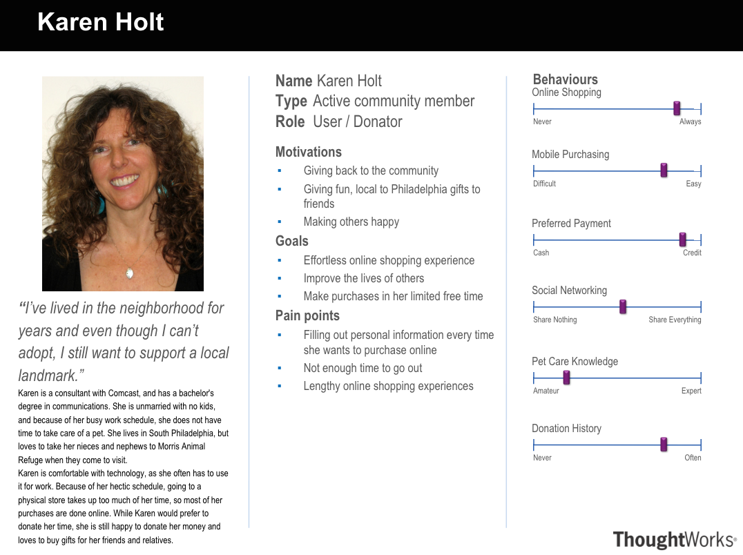
Here are a few of the personas we created based on user research and talking to our client about their types of volunteers, donors and customers. By creating these personas, we realized that there was a huge range in the types of people who would be visiting this site, so it was essential that we made it intuitive to many different people. We tried to represent the different backgrounds, interactions with the shelter, and age ranges with our personas.
Journey Mapping
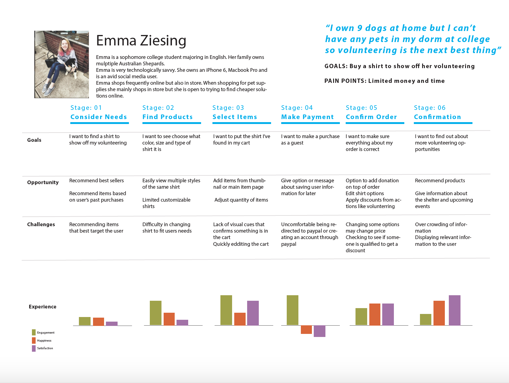
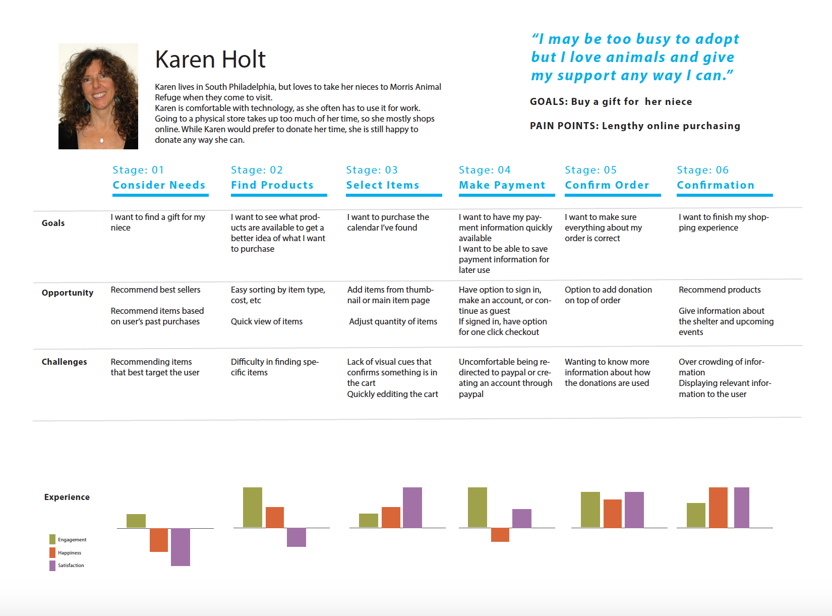
Each potential user had many different paths they could take on our site. We tried to outline some of these paths in our user journeys.
Benchmarking
I focused benchmarking not only on other animal shelters’ e-commerce stores but also on e-commerce in general. I focused on online retail experiences that were highly praised for their usability and design, such as Macy’s retail website.
Design
Wireframing
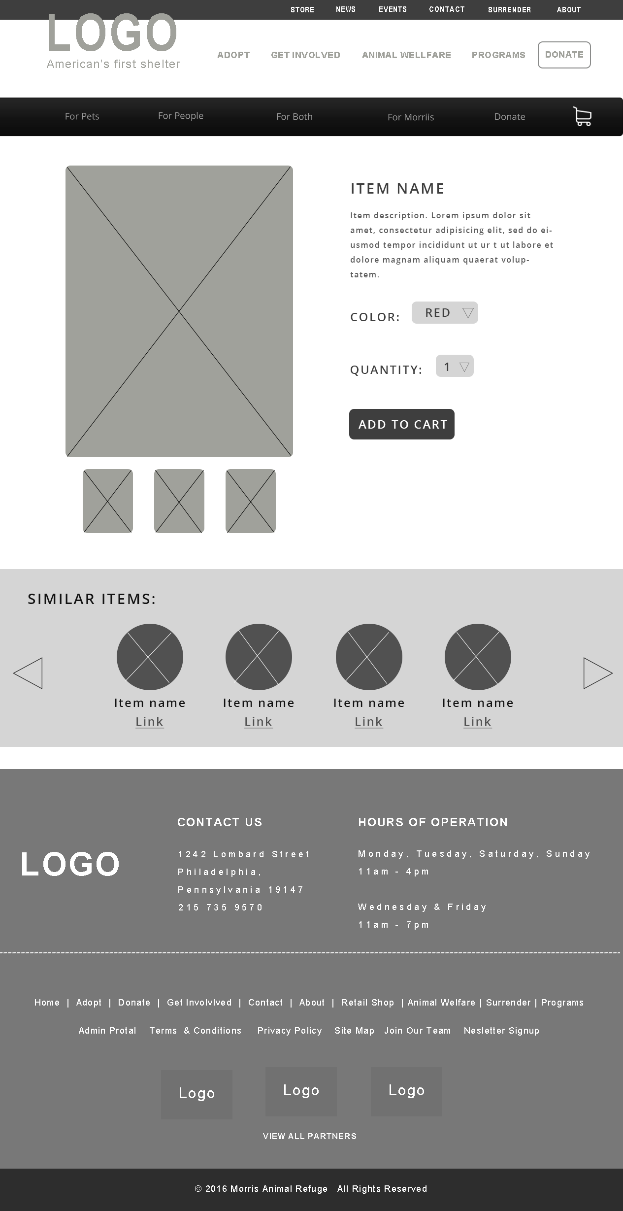
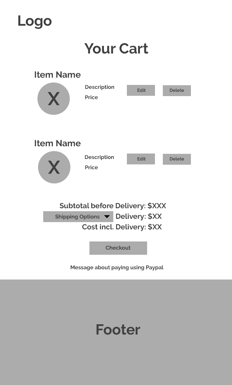
Here are the wireframes we created based on our research and AYC’s design standards that were already set for us.
High Fidelity Invision prototypes
We created InVision prototypes for both our mobile and desktop designs. We knew it was essential to create a responsive design, meaning one for both mobile devices and desktops. So we adjusted our components, such as our filter and menu by collapsing them in the mobile view.
Test
Usability testing
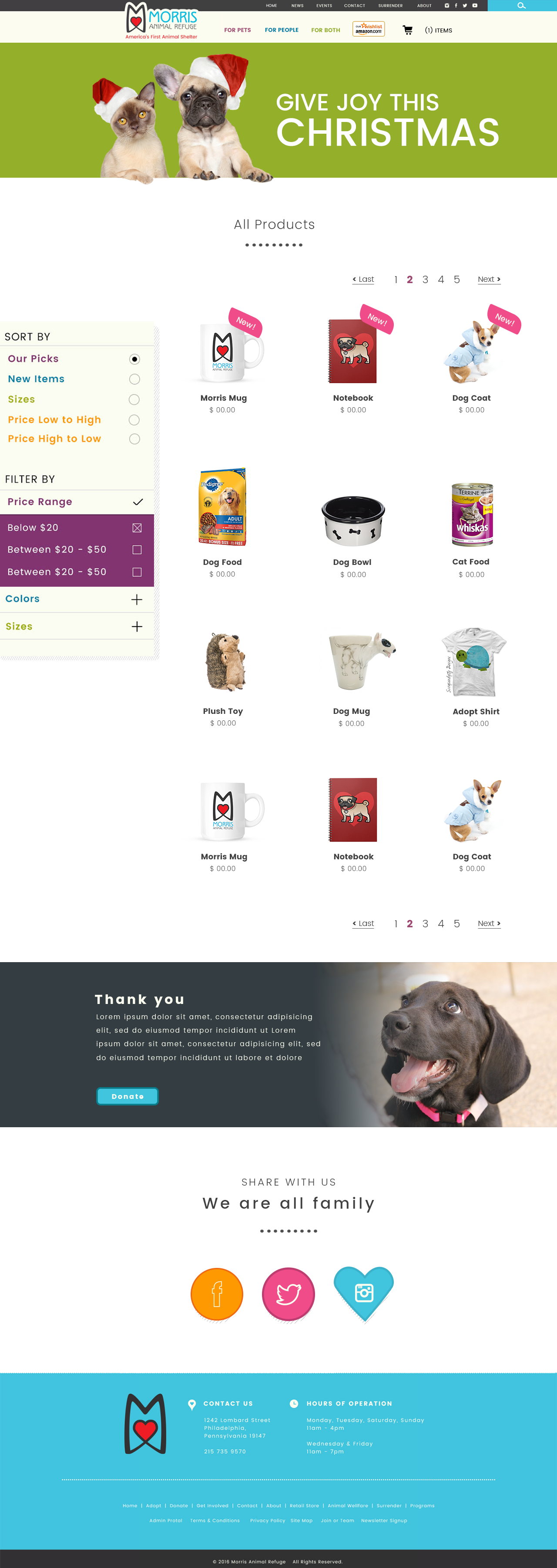
As head UX researcher, one of my main jobs was conducting usability tests. From these tests I found some of our key usability issues, such as users being confused by our original filter seen on the left. The filter was something I wanted to do full research on because through my e-commerce research I learned the importance of filters and how they can make or break someone’s shopping experience. If users are confused and cannot find the product they are looking for, they will most likely leave a website and not complete a purchase. We did not want usability issues being the reason Morris was losing any donations. The Baymard Institute was a great resource for me on e-commerce UX research.
Improving overall usability

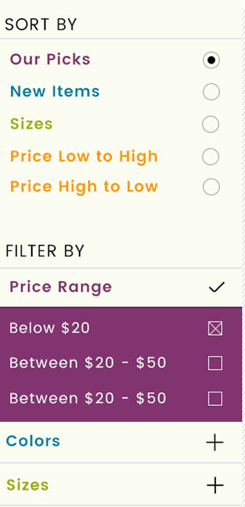
My research showed the importance of giving users options, including options they did not know they needed, such as the New Items option. Using this new filter, users are able to browse selectively and hone in on exactly what they are looking for.
I also focused my research and benchmarking on what the most common categories for filters were and the sort by, versus filter by, categories which allow users to further refine their searches.
Results
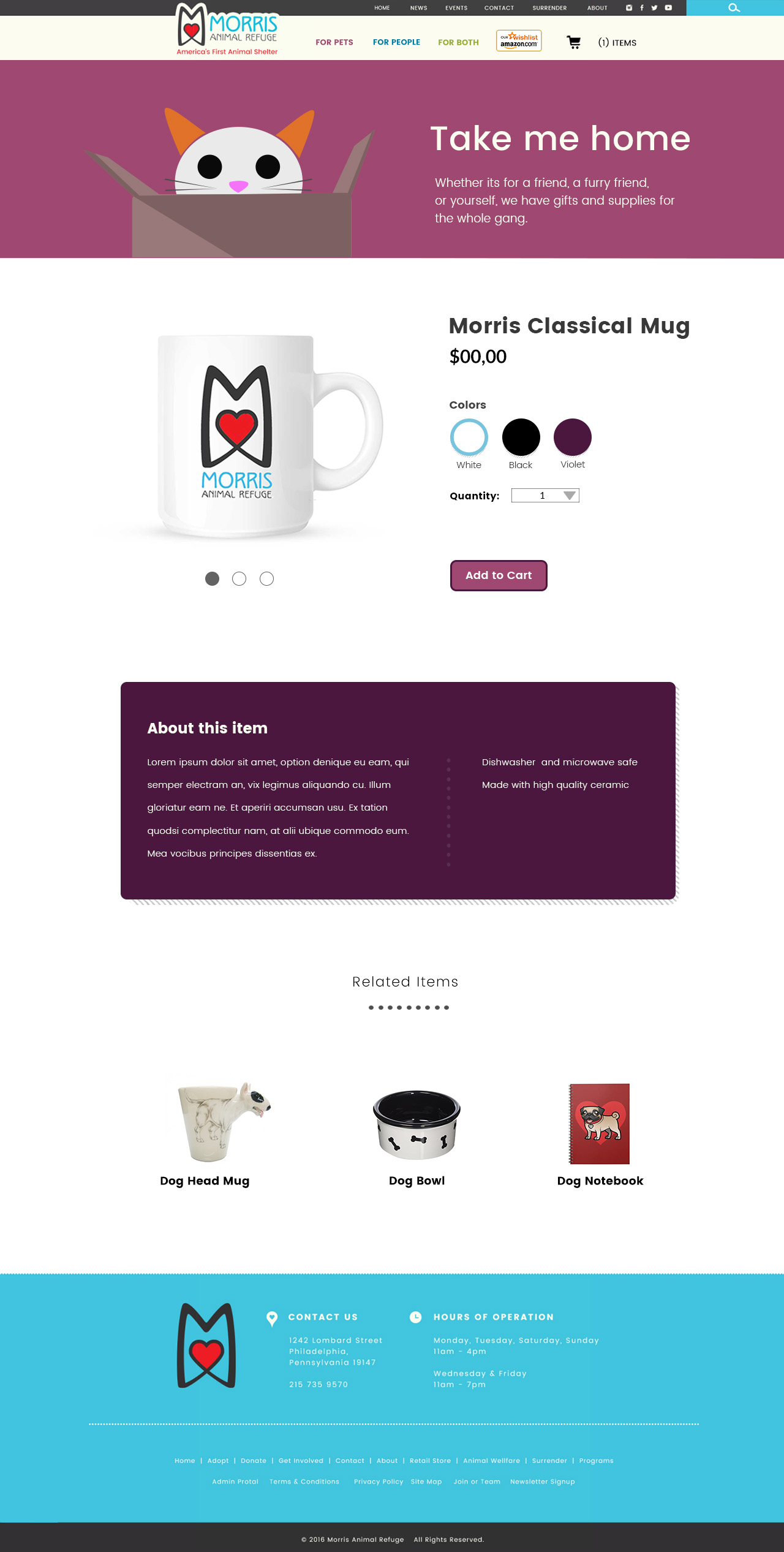
This was our final design, which includes a landing page, products page, single item page, cart, and cart summary. We used AYC’s style guide to stay consistent with Morris’ branding. We included fun banners and images of animals to remind users where the money they spend is going and to encourage them to make a purchase or donation. Since this was a class project, we handed over our designs to AYC for their use when they publish their final product.
