For a class project at Drexel University, our team was tasked with creating a mobile ordering app for Schmear It, a local food truck that sells bagels in Philadelphia. Designing this app was a class project, not intended to be actually used by Schmear It.
After brainstorming and researching potential users, we realized that a social rewards system was much more suitable than a mobile ordering system. Our decision was made because bagels are made fresh and quickly, and Schmear It already had a punch-card rewards system in place.
The Schmear It app we created allows users to keep track of their orders, save their favorite bagels, earn digital rewards and discover new combinations of ingredients based on other customers ratings. Click on the image below to see the live prototype in action!
Click me!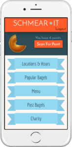
Process
As a UX researcher for this team, I started off by conducting thorough research on Schmear It’s brand, customers and values. Here are the steps I took in helping to create this app.
Research
User Interviews
By conducting user interviews we were able to find out how users use mobile ordering services and what they would like to see from a mobile ordering app
Fly on the wall (Ethnographic Study)
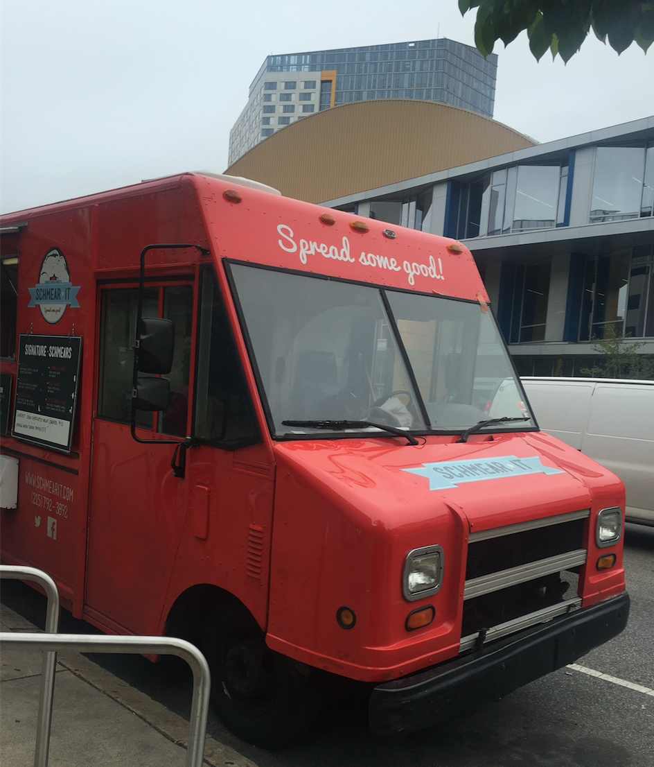
Fly on the wall testing showed us the type of customers who ordered from this truck. By standing by the truck and observing user behavior we were able to note many important points about user interactions with the truck ,which helped us make important design decisions. Schmear It had many frequent customers, which we deduced from the interactions they had with the staff. The staff asked many of the customers questions about their personal lives, indicating they had built a friendly relationship with them.
From this exercise we determined who their target users were and how many of them were extremely loyal to Schmear It. Additionally, we were able to observe the ordering process and the short amount of time that it took for customers to receive their custom made bagels. On average the wait time was around one minute, which indicated to us that mobile ordering may not be beneficial. Additionally, an app risked the possibility of removing customers’ interaction with the friendly staff.
Personas
From the fly on the wall activity, we were able to create different personas based on the types of customers we observed at the truck. Our potential users included college students, professors and local workers, such as construction workers. The most common users were college students since this truck parks on college campuses. This meant that our target users were likely familiar with smart phones and rewards apps, so there would be value in creating a digital rewards system.
Reward Systems App Benchmarking
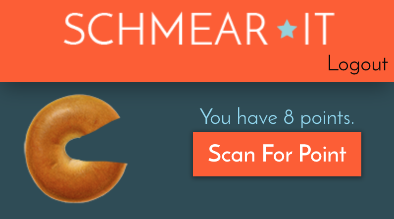
Once we determined we were creating a digital rewards system app, we did benchmarking on successful rewards systems, such as Starbucks. One of our favorite things about the Starbucks app was the visual of a cup filling up as you earned rewards. We decided to incorporate a similar idea with an image of a bagel filling up as you earned rewards.
Design
Sketches
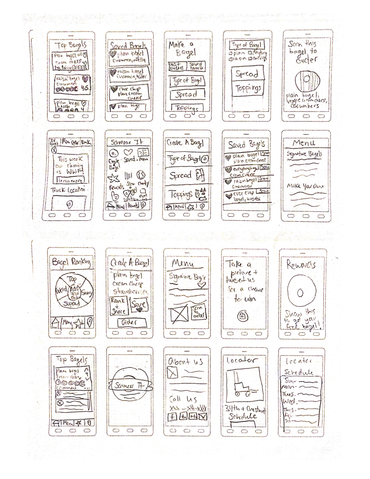
Our team participated in a ten-minute sketch session where we were each given print outs of empty phone screens and had to sketch any ideas of pages we had for our app. This led to some of the very first ideas behind our functionality
Wireframes
After creating final sketches of the pages we needed to include, we created wireframes of the pages.
Low Fidelity Prototype
As a team, we designed many iterations of our prototype. We did usability testing early in the project to ensure our design was fluid and adaptive to our users’ needs as we gained more feedback.
High Fidelity Prototype
Here is the live prototype we created: High Fidelity Prototype. The front page was fully designed by me with the idea of incorporating Schmear It’s logo banners as buttons to stay consistent with their branding.
Another important piece of the app is the charity page. Schmear It values charity work and each week chooses a different charity to which to donate. To encourage donations and keep users informed about their service, we added a charity page that informs users of the charity for that week and how they can learn more about that charity.
Test
Usability Testing
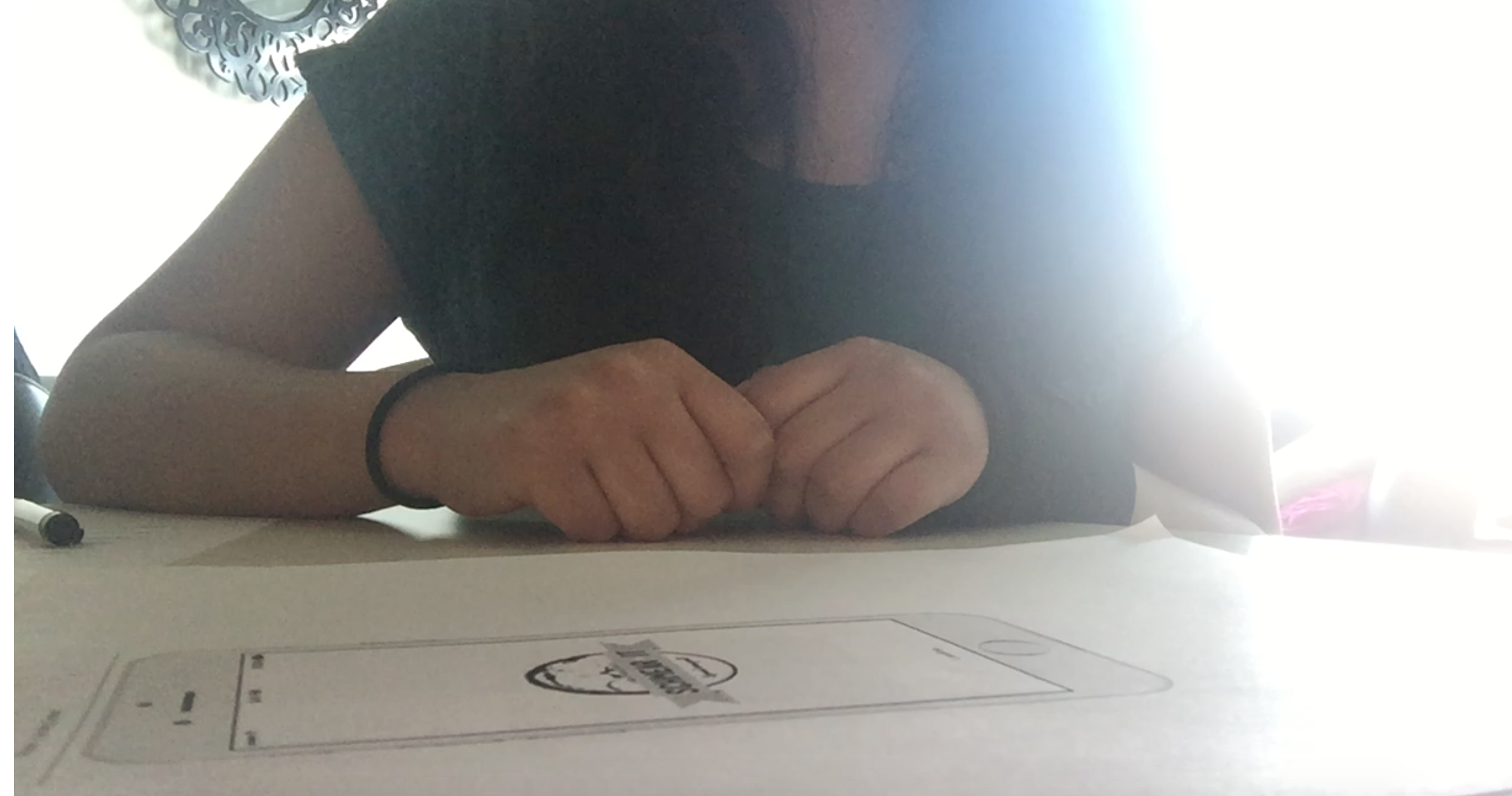
We started this process with paper prototype usability testing as seen above. Users would tap the pieces of paper after given their tasks and the next page would be presented to them. Once a fully functional prototype was created, we continued to usability test using that instead.
Schmear It is known for their many choices of toppings. After talking to our users we realized that one common concern they had was being able to try new toppings. We created a ranking system in the app that lets users rate bagels they have tried and go to the Past Bagels page to see their order history and how they rated each bagel.
Users can also check out the Popular Bagels page which shows other users’ rankings and which bagel combinations they recommend. The app has categories such as Sweet and Savory, so users can refine their searches.
Results
This app went through many iterations but in the end we thought the final design was the most true to Schmear It’s brand. By sticking to their colors, imagery and encouraging users to try new bagels, the app helps reinforce Schmear It’s branding. Also, a ranking and rewards system can help Schmear It’s loyal users feel more connected to a food truck they already love.
Reflection
This project showed us the importance of branding and user needs. By creating a rewards system instead of a mobile ordering app, we met our user’s needs in the best way possible by not just making an obvious app for a food service, but instead evaluating what would be most beneficial to their users specifically and staying true to the brand’s freshness and in-person interactions.